Why Most Power BI Dashboards Fail: 10 Mistakes to Avoid
-
Written by
-
Post DateNovember 25, 2025

Power BI
Power BI makes it easier than ever to turn unorganized data into meaningful business insights. But even with an amazing tool like Power BI, many dashboards fail to deliver real value not because of the data, but because of design mistakes that affect clarity, usability, and decision-making.
If you want to build dashboards that look professional, load fast, and help users understand insights clearly, you must avoid these common mistakes.
Let’s explore the top 10 errors and how you can fix them.
In this blog, we’ll break down the 10 most common mistakes people make while designing Power BI dashboards, along with why each mistake matters, what it causes, and how you can fix it.
Let’s begin! 🚀
1. Not Understanding the Audience

Designers build dashboards based on what they think is important, not what the user actually needs.
Problems :-
- Insights become irrelevant
- Decision-makers don’t trust the dashboard
- Creates confusion and low engagement
Our Solution :-
- Talk to users before designing
- Identify what questions they need answered
- Build dashboards around real business goals
2. Poor Layout, Spacing & Alignment

Misaligned visuals, uneven spacing, and random placement create a messy dashboard that looks unprofessional.
Problems :-
- Breaks visual flow
- Makes dashboard hard to scan
- Distracts users
- Reduces clarity of insights
Our Solution :-
- Use snap-to-grid and alignment tools
- Maintain equal spacing between visuals
- Group related visuals logically
3. Using Too Many Colors
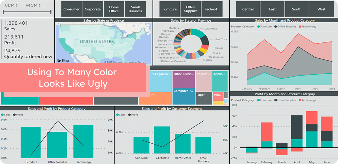
Beginners often use 10–15 colors without meaning, creating visual confusion.
Problems :-
- Overwhelms the user
- Harder to compare values
- No clear color meaning
- Reduces visual hierarchy
Our Solution :-
- Use 2–3 main colors
- Use accent color only to highlight insights
- Apply a consistent theme across all pages
4. Choosing the Wrong Chart Type

Using pie charts for long lists, bar charts for trends, or fancy visuals for simple data leads to misinterpretation.
Problems :-
- Misleads users
- Makes patterns harder to identify
- Reduces accuracy of insights
- Slows down understanding
Our Solution :-
- Use bar/column charts for comparisons
- Use line charts for trends
- Use KPIs/cards for single values
- Keep visuals simple and meaningful
5. Misusing Bookmarks

Bookmarks are used incorrectly or too many are created, making navigation confusing.
Problems :-
- Users get lost
- Buttons and navigation break
- Debugging becomes difficult
Our Solution :-
- Use bookmarks only when needed
- Keep navigation simple
- Name and organize bookmarks clearly
6. No Visual Hierarchy

Ready To Build Power BI Dashboards That Users Actually Love?
Let our experts help you design fast, accurate, and impactful dashboards that drive real decisions.
When all visuals have the same size, color, and placement, the user doesn’t know what to look at first.
Problems :-
- Place key KPIs at the top
- Use larger visuals for important data
- Design top → middle → bottom or left → right flow
Our Solution :-
- Important KPIs get hidden
- No clear reading order
- Users feel confused
7. Overusing Slicers & Filters

Too many slicers take up space, slow the dashboard, and confuse users.
Problems :-
- Clutters the layout
- Reduces space for charts
- Makes dashboard slower
- Harder for non-technical users
Our Solution :-
- Use only essential slicers
- Prefer dropdown slicers
- Move less-used filters to the filter pane
8. Not Optimizing Dashboard Performance

Large datasets, too many visuals, and heavy DAX formulas make dashboards slow.
Problems :-
- Slow dashboard = poor user experience
- Users avoid dashboards that take too long
- Harder to refresh and maintain
Our Solution :-
- Reduce number of visuals
- Use efficient DAX
- Optimize data model
- Disable unnecessary interactions
9. Not Using Tooltips Effectively

Tooltips are empty or show default values instead of adding deeper insight.
Problems :-
- Missed opportunity for “hidden insights”
- Forces user to open other reports for detail
- Makes dashboard less interactive
Our Solution :-
- Create custom tooltips pages
- Add YoY, MoM, or category details in tooltips
- Keep tooltips clean and helpful
10. Ignoring Data Quality

Dashboards are built without checking for missing values, duplicates, or incorrect data.
Problems :-
- Misleading insights
- Wrong decisions
- Loss of stakeholder trust
Our Solution :-
- Clean and validate data before modeling
- Use Power Query for transformations
- Set data quality checks